
Adding text to a video is easy. Adding text that people can actually read, that stays up long enough, and that the platform does not cover with its own interface — that is the part worth ten minutes.
This guide covers both: the mechanics on an iPhone, and the handful of rules that separate text that works from text that gets ignored.
Table of contents
- Titles vs. captions — two different jobs
- Step 1: Add the text
- Step 2: Choose a font that is doing a job
- Step 3: Size it for a phone at arm's length
- Step 4: Make it survive the footage underneath
- Step 5: Time it — the rule that matters most
- Step 6: The safe area
- Common mistakes
Titles vs. captions — two different jobs
Worth separating, because they want opposite treatment.
| Titles | Captions | |
|---|---|---|
| What they do | Announce, label, divide | Transcribe what is said |
| How many | A few | One per line of speech |
| Size | Large | Medium, consistent |
| Placement | Anywhere, deliberately | Same place every time |
| Written by | You | Generated from the audio, then edited |
If what you want is a transcript of speech, do not type it by hand — see how to add subtitles to a video on iPhone, which does it automatically and on-device.
This guide is about titles.
Step 1: Add the text
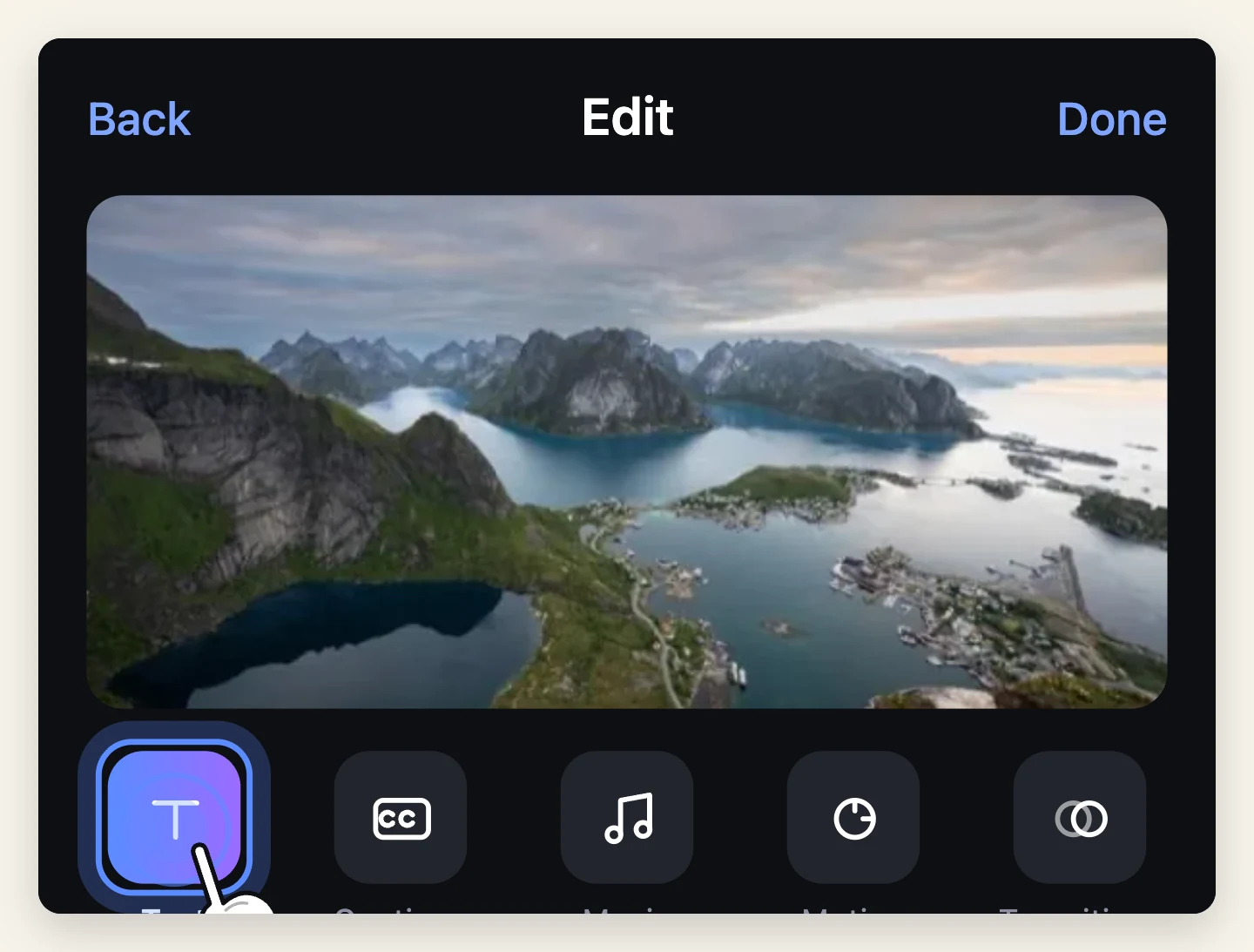
Open your project in Muse or Moments and choose Add text. The text block appears on the stage and on the timeline, so you can see both where it sits in frame and when it appears.
Drag it on the stage to position it. Drag its ends on the timeline to set how long it stays.
[Screenshot: Add text — the text block on the stage with its timeline bar below]
Step 2: Choose a font that is doing a job
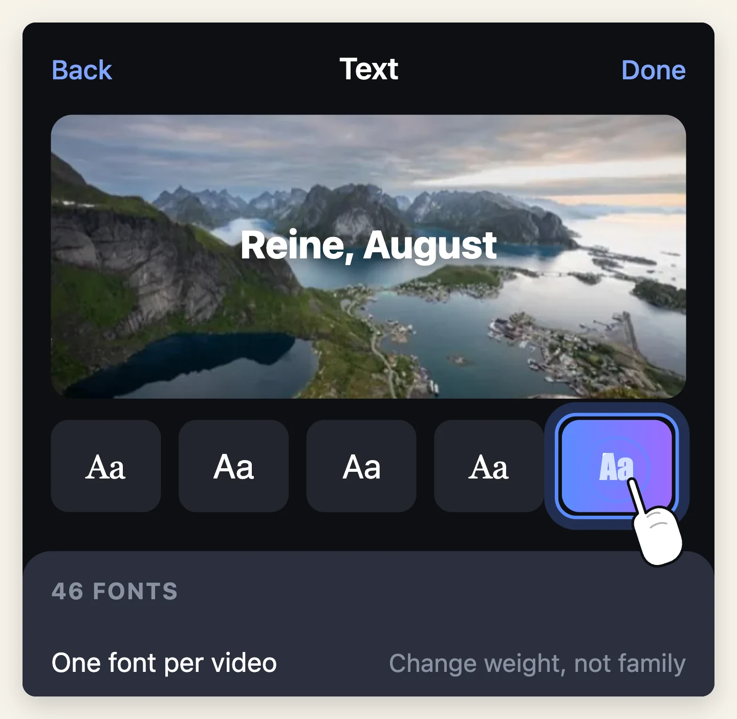
There are 46 fonts available, with size, colour and alignment. The full library is part of Pro; there are fonts available without it.
A shortcut that will serve you better than browsing all 46: pick by the job, not by the look.
- A heavy sans for anything that must be read in one glance on a moving image. This is the right answer most of the time
- A clean medium-weight sans for longer lines and lower thirds
- A serif only when the subject is already calm — a wedding, a memorial, a slow landscape. On fast footage it disappears
- Script and decorative faces for one word, large, and nothing else
The one rule: one font per video. Change size and weight, not family. Two fonts fighting looks accidental.
Step 3: Size it for a phone at arm's length
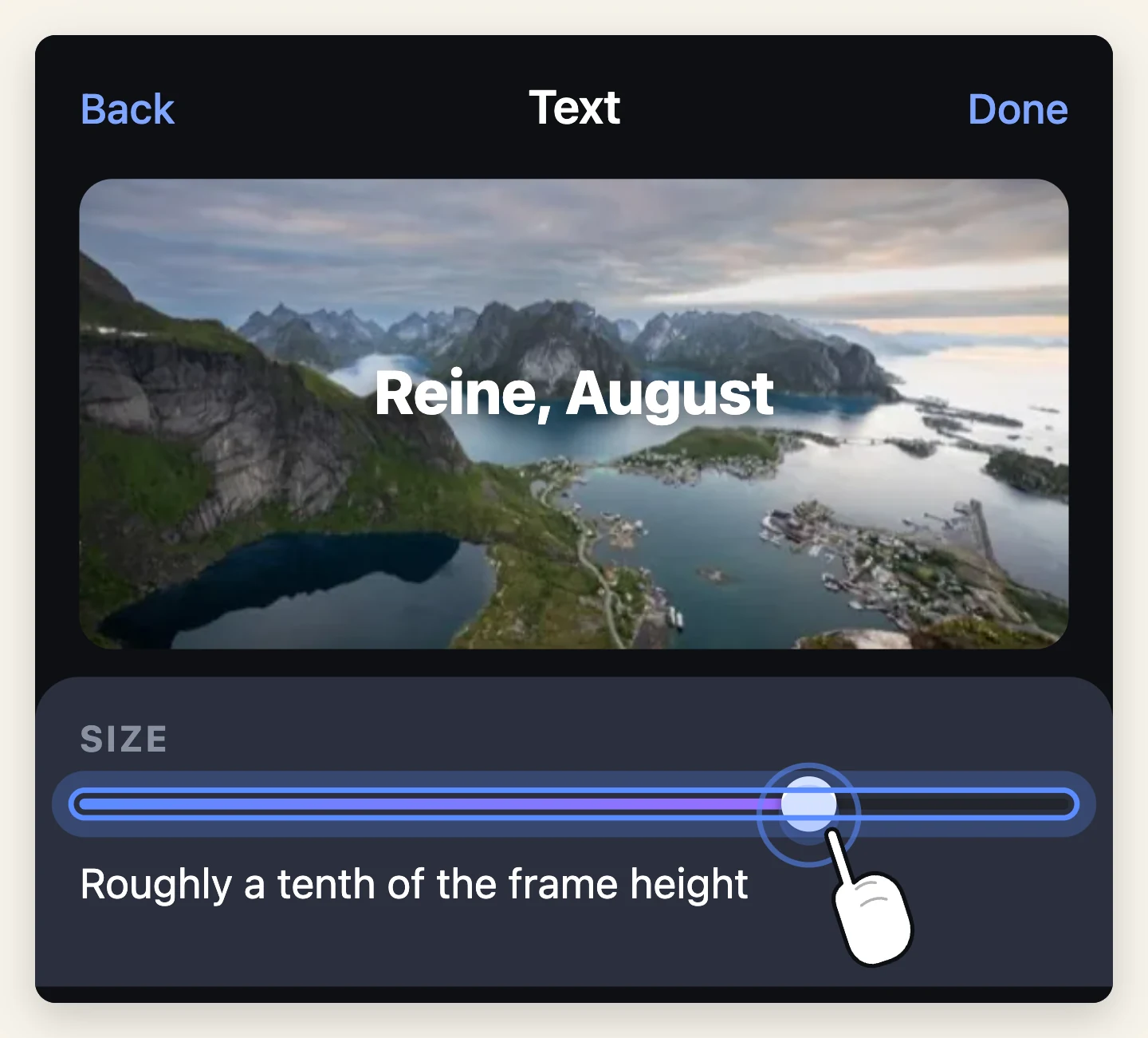
Everyone sets text too small, because everyone judges it on their own screen at 30 centimetres while editing.
The test: hold the phone at full arm's length and glance at it for one second. If you had to look twice, it is too small.
Practically, on a vertical video, a title should be roughly a tenth of the frame height per line of capital letters. That feels enormous in the editor. It is correct in a feed.
Step 4: Make it survive the footage underneath
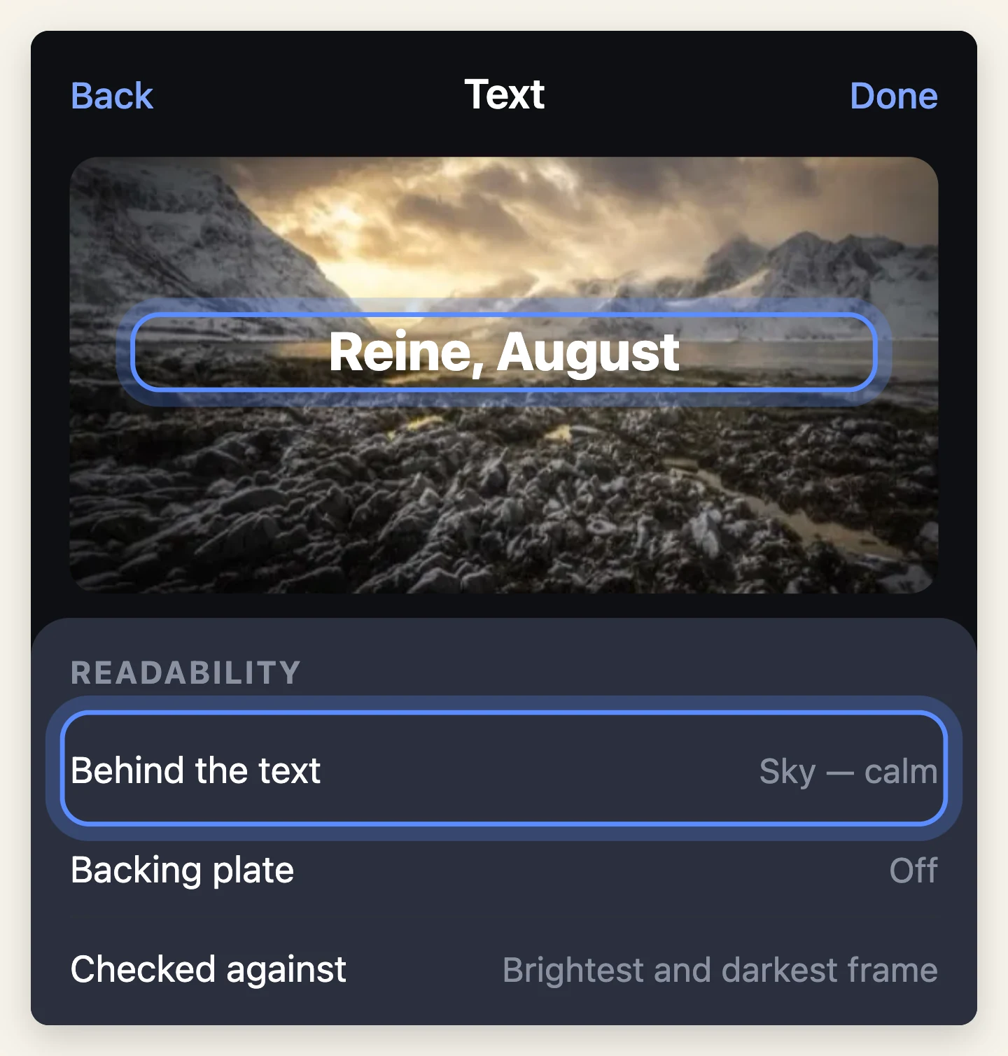
White text on a bright sky is invisible. So is dark text on a shadow. And footage moves, so a spot that works at second one may not work at second three.
In order of how much they help:
- Put it somewhere the footage is calm. Sky, a wall, out-of-focus background. Free, and always the best option
- Give it contrast. Light on dark, dark on light. Check the brightest and darkest frame it is up for, not the first one
- Give it its own backing — a solid or semi-transparent block behind the type — when nothing else works
If the text is still hard to read after all three, the shot is wrong for text. Move it to a different shot.
Step 5: Time it — the rule that matters most
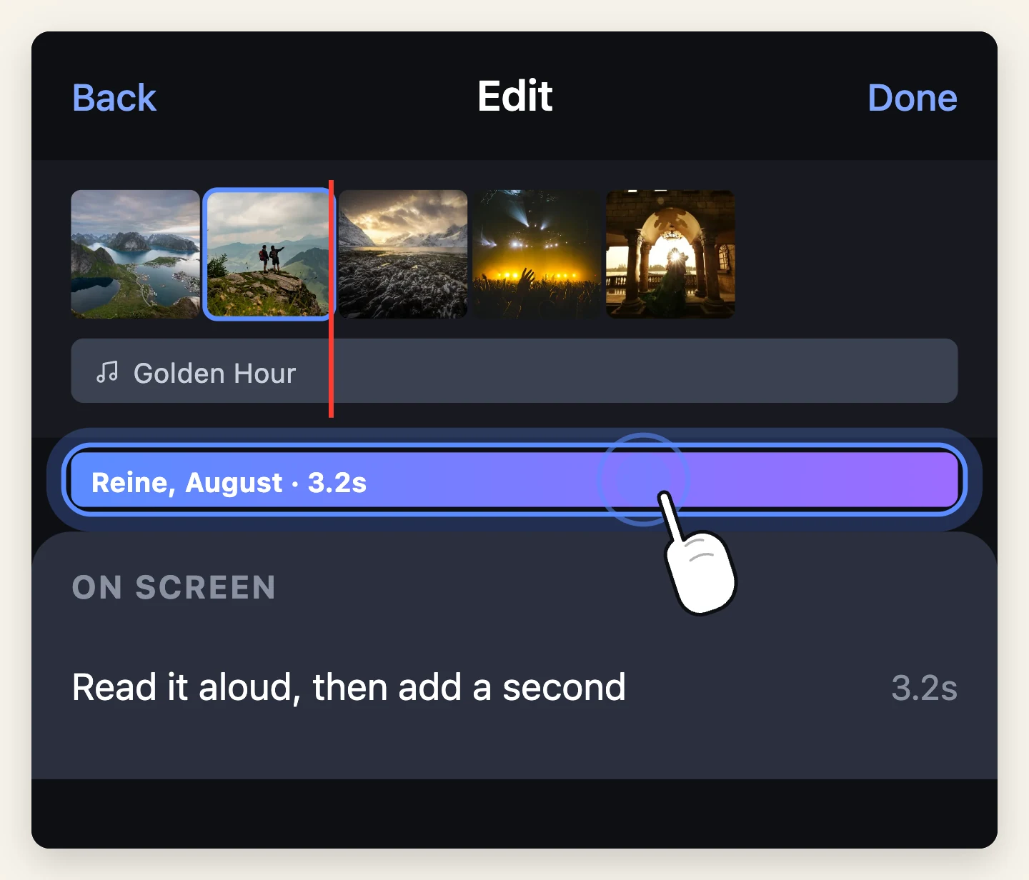
The single most common fault in phone video is text that flashes past.
The working rule: read it aloud at a normal pace, then add one second. That is the minimum time it stays on screen.
- Two or three words — about 2 seconds
- A short sentence — about 3 to 4 seconds
- Anything longer — it is too long. Cut it down or split it in two
Also give it somewhere to be. Text that appears on the very first frame of a cut and disappears on the last feels tied to the edit rather than placed. Let it start a beat after the cut.
Step 6: The safe area
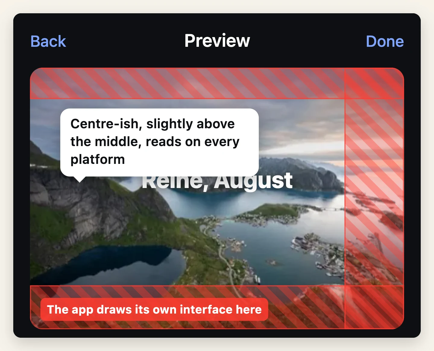
Your video is not shown on a blank screen. The platform draws its own interface over it.
- TikTok — bottom ~15% carries the username and description, right edge carries the buttons
- Instagram Reels — bottom and right edge, similar
- YouTube Shorts — bottom and right edge
- Stories — top strip for the progress bars, bottom for the reply box
So the usable area for text is roughly the middle 70% vertically, and the left 80% horizontally. Anything outside that is a gamble.
The single easiest improvement to most people's on-screen text is moving it up. Centre-ish, slightly above the middle, is readable on every platform.
Preview in the real app before publishing. Upload it, look at the preview screen, and check nothing is buried. It takes thirty seconds and catches what the editor cannot show you.
Common mistakes
Too small. Covered above, and still the most common.
On screen too briefly. Also covered. Both come from judging your own video while already knowing what it says.
Too many words. On-screen text is a sign, not a paragraph. If it needs a second line, it probably needs to be half as long.
A different font every time. Pick one and stay there.
Text in the corners. Corners are where interfaces live and where players crop.
Never checking it on the platform. The editor shows your video. The feed shows your video plus a username, a caption, four buttons and a progress bar.
And if the text keeps fighting the footage, the answer is usually not a better font. It is a different shot.

Moments
Photo movies set to music — the app this guide is written for.

Free to try. Nothing to sign up for.